Body
The new VoiceThread brings many new features and is fully accessible.
This summer, the new VoiceThread will go live for everyone, and VT Universal and the old views will be discontinued. A full list of new features and a video walk-through are linked at the bottom of this article.
The New VoiceThread will go live for everyone early this summer, but you can enable the new view now.
If you'd like to try the new VoiceThread interface before it goes live for everyone:
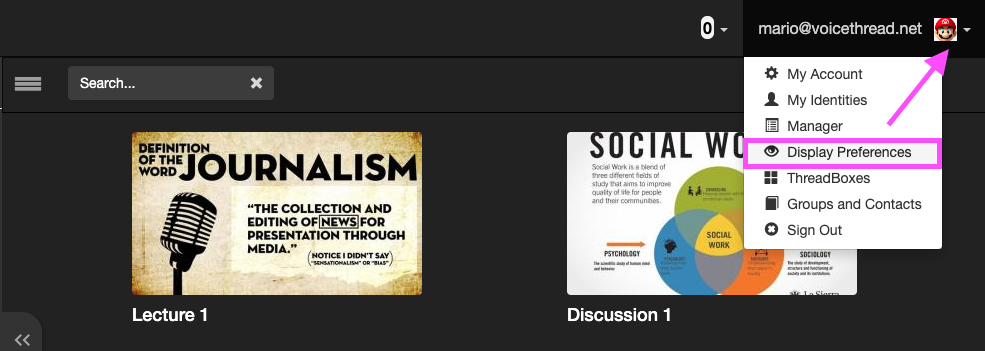
- From your home page, click on the menu icon next to your identity image and select “Display preferences.”

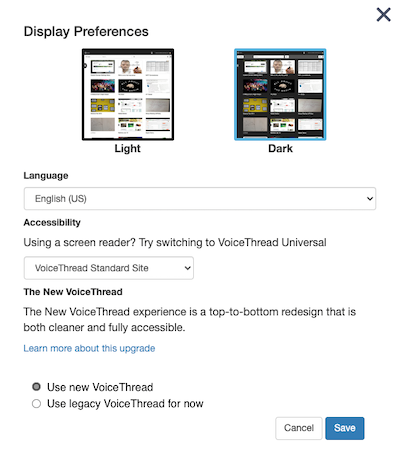
- Select the radio button for “Use new VoiceThread.”

So What's Different?
Here's the full list of what's new, from VoiceThread documentation:
Highlights and changes
New features
- Bulk comment management options
- Audio descriptions of slides
- One conversation view
- Zooming and panning while commenting
- Option to sort VoiceThreads by “most recently active”
- Compact list of all VoiceThreads in the home page sidebar
- Media sources included in the slide upload options inside an open VoiceThread
- Ability to jump to another slide while commenting without having to flip through them sequentially
- View assignment thumbnails in the course view
Changes
- New version is fully accessible, so VT Universal is no longer necessary
- Comment button moved to the left side of the page
- Slide navigation buttons moved to the left side of the page
- Increased visibility for closed captions
- Comments timelines appear inside the comment window, not at the bottom of the thread
- CC button moved to the bottom-right corner of the page
Coming soon
- Drag-and-drop sharing
- Bulk actions on the home page (deleting and sharing multiple threads at once)
- Dark mode for the home page
- Customize closed caption display
Discontinued features
- Phone commenting
- Full-screen button
For a full walk-through of new features, see this video from VoiceThread